Team:
Heather Brewer, Print Art Director
Jeremy Culp, Digital Art Director
Aubree Burg, Digital Designer
McKenna McIntyre, Digital Designer
“Heather consistently delivers professional, strategic designs that zero in on the target audience and delight authors. Her work has resulted in a measurable increase in sales and helped take our publishing house to the next level.”— Miranda Gardner, Executive Editor, Discovery House
Job: Repackaging of a classic title that’s been around over 75 years.
Challenges:
1) Over 20 skus available in many different designs—confusing our audience and cannibalizing our own sales.
2) Keep a look that was familiar to our audience, but felt fresh.
3) Design had to work across digital and print platforms.
Solutions:
1) I recommended we conduct a full inventory of our MUFHH product offerings. We narrowed our products down to from twenty to six, offering an Updated and Classic edition at 3 different price points.
2) We stuck to similar colors that had been used on previous editions (green and red) but used an updated, brighter version. Stacked the title in the traditional four lines, but used a more vertical font that commands more presence. The jewel-tones offset by the white gives it a fresh look and modern appearance while also retaining a classic look that will remain relevant for a long time.
3) Collaborated with the digital art director and design team to ensure icons, typography, and imagery would work well in print and online.
Results: Increased sales by over 30%, and because we had less skus behind the sales, we made bestseller lists giving us more visibility across platforms.
REDESIGNING A CLASSIC by Heather Brewer
There is a certain amount of hesitation and caution that comes when rebranding a long-standing and successful product, especially when you aren't the owner of that product, but a trusted steward. It was a challenge I embraced, a balancing act between honoring a century-long past while carrying forward a message for generations yet to come.
Sales increased 19% after launch of rebrand.
2017 is the 100th anniversary of the passing of Oswald Chambers, a heavy-weight in Christian culture and theology. It also marks the beginning of Biddy Chambers' work collecting his writings into what is known today as one of the best selling devotionals of all time, My Utmost for His Highest.
To commemorate this classic and relevant devotional, Discovery House undertook a brand overhaul across digital and print platforms. I had the privilege and responsibility to Art Direct the new designs and book packaging.
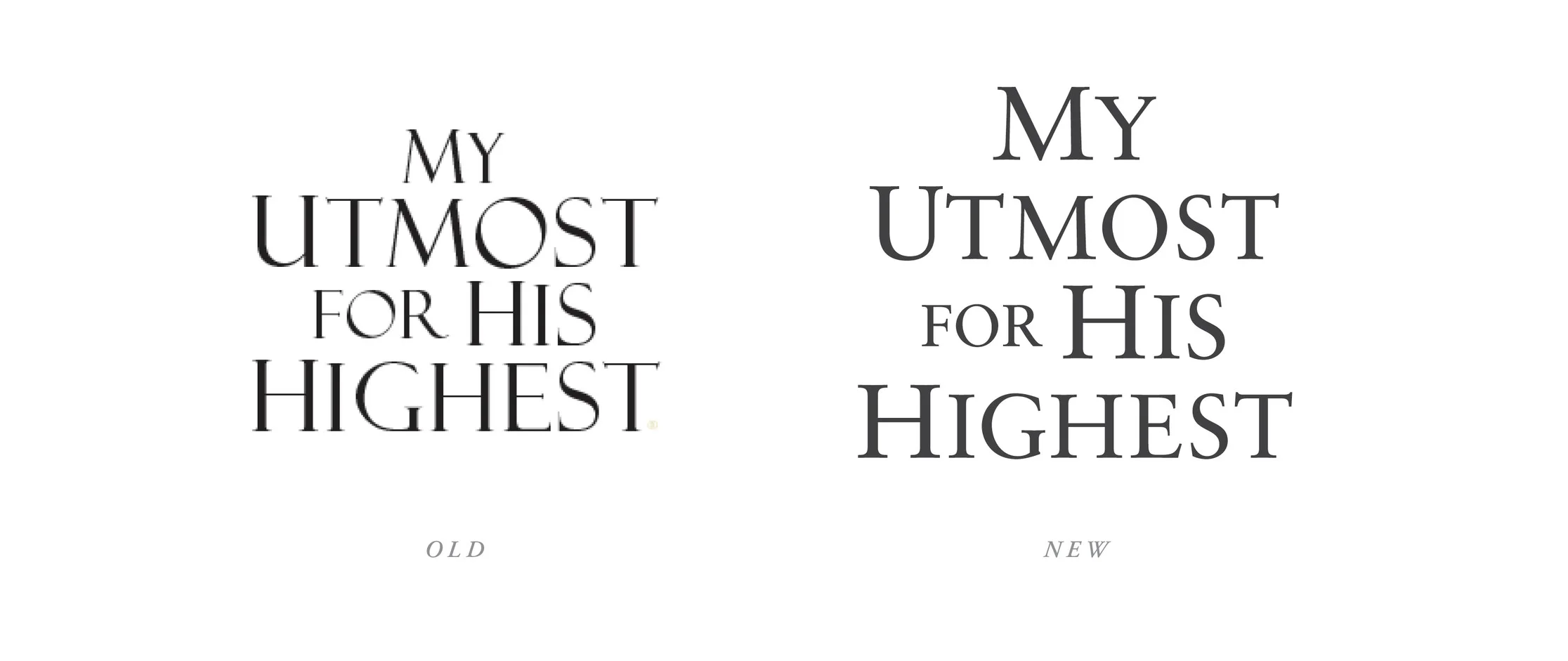
I chose a serif font to retain a classic feel and kept the stacking of words as they had been presented in previous editions. The new font has a vertical presence that better fills the cover space and gives greater prominence to the title. Now the title visually reaffirms the concept of ‘utmost’ and ‘highest.’
My Utmost for His Highest has been around for over seventy-five years, kept on millions of nightstands or carried in briefcases for easy access and daily readings. Today, My Utmost is available as an app and is read by thousands of people online. It was important to myself and the Digital Art Director, Jeremy Culp, to create a seamless user experience across digital and print platforms. In order to accomplish this goal, we needed to develop a visual image that could be used both in social media and applied to print products.
The previous icon was a place-holder that didn't represent the message of Oswald Chambers or recreate successfully when applied to print. We needed something that looked good digitally, but could hold it's weight on a cover. The imagery of a path and a mountain show the journey Chambers' inspires his reader to take toward greater faith, accountability, and leadership over the course of a year. This icon is used for social media and is incorporated in the design of the paperback and hardcover editions.
A common misconception about Oswald Chambers is that he was a dusty, old scholar. In fact, he was an adventurous, world-traveling young man who died in his early forties while stationed in Egypt. In creating the jacket art for the hardcover, I wanted to challenge people's perception of Chambers and included a photo of him that hadn't been commonly circulated, one that captured the curiosity and determination of youth.
It was an honor to work on something that has impacted millions of lives and it is my hope that it will continue to impact lives for decades to come.


